
By Adam Garvey
In recent years, several states and municipalities have taken it upon themselves to redesign the flags that represent them. States like Minnesota and Utah have swapped their old, “Seal on a Bedsheet” style flags for new, more streamlined designs. Since this trend began, I’ve been thinking about how it applies to the flags I see in my life all the time. There’s no doubt that New York’s State flag fits the disparaging “Seal on a Bedsheet” concept in flag design. While not ugly, the flag is a bit bland. Like many state flags, it was based on the battle flag used to represent New York troops during the civil war and could use some updating. While I wouldn’t call it bland, Rockland’s flag could certainly do with some updating as well.
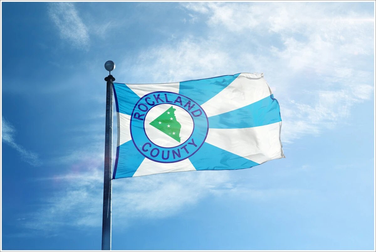
The current flag of Rockland was designed as part of a county-wide contest by a gentleman from Congers named Pierce Coulter. His was among the over 100 design entries in the contest, judged by the then members of the Rockland County Legislature. For those who may not have seen it, the flag of Rockland features a seal with the words “Rockland County” around an image of Rockland’s borders colored in green. Five stars are featured on the shape of Rockland, placed in relation to the geography of Rockland’s five towns. This is set against a background of alternating blue and white strips emerging out of the seal.
We could do better. Like many flags for local municipalities, the flag of Rockland doesn’t exactly pop and isn’t seen much outside of government contexts. You may have seen it walking from the parking lot to serve jury duty, or maybe to fill out a marriage license, but you most likely haven’t seen it just out and about. Outside of local government or the website of the Rockland County Times, the flag simply has no presence.
A viral guidebook for flag design has prompted a lot of these recent changes. “Good Flag, Bad Flag” is a booklet released by the North American Vexillological Association. First printed in 2006, it has become the cornerstone for contemporary flag design. In it, they outline five rules for good flag design. Keep it simple, use meaningful symbolism, two or three basic colors, no lettering or seals, and to be distinct yet related. Rockland’s flag follows some of these rules, while breaking others. The flag is by no means simple, though it uses meaningful symbolism and keeps the colors consistent. It also features a type of seal with “Rockland County” in big bold letters. The striping visually links Rockland, not to other municipalities in New York or the NYC Metro Area, but truthfully to the flag of imperial Japan, which featured the same striping style.
There’s a lot of pride in Rockland County. After all, it’s a great place to be from. Good scenery, good food, not being in New Jersey, we have a lot going for us here. So why not extend that to the banner that represents us? If Rockland had a more appealing flag, I think people would want to rep it. To put it up in a store window or wave it on flag poles in a park or on a main street.
I think Rocklanders deserve a flag that they want to see or wave themselves and the current flag just doesn’t cut it.
Could Rockland Have a Better Flag? added by rctadmin on
View all posts by rctadmin →
You must be logged in to post a comment Login